
A new fitness business has a story to tell. That story starts with the right logo.
If you are thinking of entering the fitness business, one of the first things you’ll need to come up with is a logo. A logo is the visual representation of your business. It is not your brand. Your brand is what people think of you and how they feel about you. But your logo is a visual representation of your brand.
![]()
Not all fitness brands are the same. Not all fitness logos should be the same. At the most basic level, there are different types of fitness businesses:
- gyms
- coaching
- fitness supplies
- specific activities
If you want to run a specific activity, that narrows down your logo mangowebdesign.com choices quite a bit. Martial arts and cycling are visually different to begin with. But if your business idea is more generic, you’ll have to focus on your approach. What are you really selling? Here are a few examples:
- body pride
- weight loss
- total health
- feel-good lifestyle
- sense of well-being
- boot camp challenge mentality
Your approach will dictate such things as shapes, colors and fonts. You can try some of these out for free at Designhill’s Logo Maker. This nifty little tool let’s you assemble logos based on the elements you choose. I like it because you can get a logo for as little as $20, and you can get almost unlimited versions to hum and haw over…without paying more for each one. Here is just a peak at some of the icons you can use.
![]()
As you can see, there are many different approaches. Some are bold. Others are outlines. Some focus on equipment. Others focus on the body.
Here are just a few of the logos I generated using just one icon. I picked similar ones, all with the same image and all with clean, bold fonts. There were others with fancy fonts and different shaped borders, but none of those spoke to me.
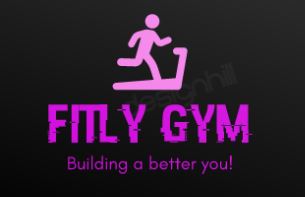

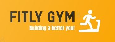
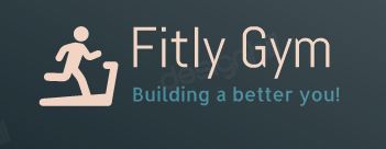
I love the bright pink and how it contrasts. But that color combination might turn away a lot of the he-men weight lifters. So one has to be careful to understand one’s market before choosing colors and fonts.
Keep in mind how you’ll use your logo. It will probably feature prominently in your website design. You might need to use it on stationary and on t-shirts. You might want to use it on business cards, pamphlets and packaging, too.
And as much as you want it to stand out in color, contrast is also important. There will be times when you’ll need to use a black and white version of your logo, so make sure it works without color, too. That’s why I prefer a bold icon to an outline.
One of my favorite fitness logos is Sail’s. This is an outdoors store that sells camping equipment, kayaks, fishing equipment, etc. It has a number of iterations of its logo. You get to do that when you get big. They all feature a mountain, and I love hiking.![]()
The version on the Sail website is OK. It features just the A mountain.
Some iterations feature a hiker on the mountain, inside the “A” of the “Sail”. That’s the one I like. It’s what you’ll find on the front of their stores.
![]()
The only question is, why Sail? What kind of a name is that for a hiking, fishing, camping, kayaking store?
If you want more fitness logo ideas, here is a fitness logo gallery. Or you can do an image search on Google for fitness logos. The most common elements for a fitness logo seem to be barbells, biceps and power. Is that your business idea? If so, run with it. If not, create a logo that matches your angle – your brand.

Hi David!
The discussion about branding, logos etc. Is interesting. It’s an excellent pin-out you list here of what to remember when setting up a logo, so it matches the business.
You pointed your audience to the Sail logo. That’s a well-designed logo because it’s visual and straightforward at the same time.
Sincerely,
Edna Davidsen
Especially the colour combination is also important for the logo so that People can easily differentiate your brand from the others. Am I Right?
We should first create the logo in black and white. Thanks for this post-David.
High impact Image and branding is really important in any marketing strategy. It is particularly crucial to start off on the right angle as branding is a long-term process and you absolutely want to avoid having to go back to the drawing board a few years out. Thanks for your great post!
I’m still having trouble creating the best logo for my practice and blog. You would think that this would take no longer than a few minutes but I had no idea how many weeks I would need to spend on this alone!!!